Having missed the proper market assessment and being totally sure the app is worth being on the market and as the team consisted of developers mostly, the first steps were obviously seen as starting the development itself. As the development team was ready and motivated to kick off and the main features of the app were already described in the created software development specification there was no time for creating proper designs.
Mistake #2 – No proper designs before the development is started.
As the initial prototype we used screenshots of the competitors’ applications from different countries with enhancements made right ahead without a design professional. Sometimes we think that we can easily create something on the go as the timing is limited and it causes even more issues during the Startup lifecycle.
This mistake of missing the design creation for our mobile application caused such instant issues for us:
- Each Front End developer was making his own changes/tweaks which were not consistent with the overall app.
- Each on the team had a slightly different vision of the final UX despite the fact all the features were outlined in the specs file.
- It led to time consuming discussions during the development process which blocked the process and made us to redevelop already created features.
Because of that the first couple of weeks were wasted. Timing is crucial and we couldn’t afford that.
Solution
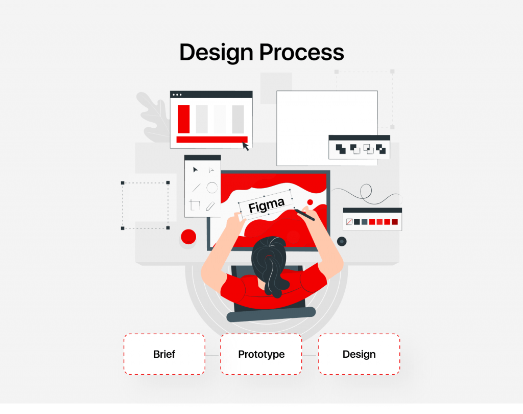
The adequate solution was to involve a web/mobile designer who created a proper wire framing of the main user flows which were first confirmed by the team. It is quite important that firstly the initial prototype is designed to be confirmed by the team which is in our case a kind of target audience the app is supposed to be built for.
Then the final designs were delivered.
It’s cheaper to make mistakes during the design process
Mobile design is a robust process comparing to the development itself which means that it’s better to make all the possible changes, updates and tweaks at this stage of the product development rather than during the software development as the costs will be much higher for updates of the already delivered software product.
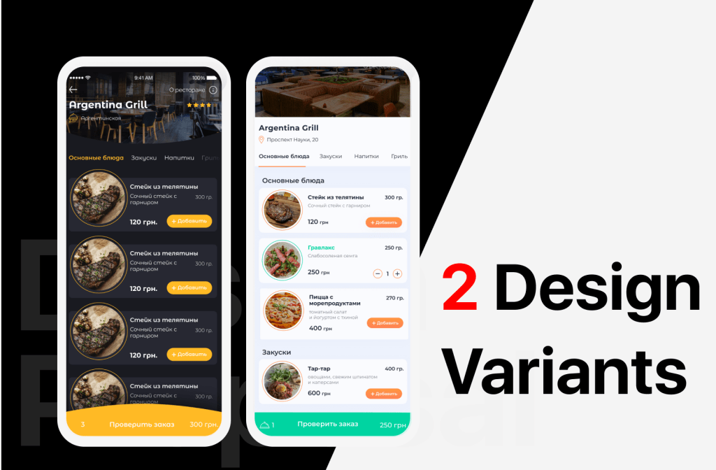
Why? In our case we had 2 versions of design implementations and the latter one become the main one. When we were switching from the version 1 to version 2 for the design team it took 30 seconds to create a nice half round element for the menu of the application and apply it for all the pages of the project. For the dev team it appeared to be almost impossible and they’ve spent a couple of days for investigation until we’ve understood it’s not worth working on that.

Our company’s rule – prototype (designs) first!
That’s why for every client we’re working with we insist on creating a prototype first and validating it with potential customers even if it affects our own company’s needs (for instance, we have a development team ready to start the project ASAP). It’s always better to build a market-fit prototype first and validate it with your target audience. As it’s written in Resti #1 episode: you can gather potential users in LinkedIn and schedule free interviews by giving a value to your respondents. And during that interview you can also ask them to go through the prototype you’ve created and see how they behave and interact with your application. I do also know a Startup which was gaining investments and despite the fact they had users who were already ready to pay for their services after only one pitch, investors asked to create a clickable design prototype first and only after a successful overall feedback about app from potential users they were invested and the actual development started. I consider this as the most proper approach to building a software application and finding a market fit model. It saves you money and time. What could be better?
Let’s dig further into the design and prototyping process to find out how to hire a good designer and ensure your design will be good for the development team.
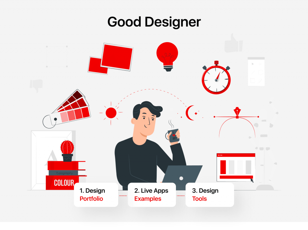
To find a good designer you need to:
- Look for a portfolio of similar apps created by that designer.
- Ask for live apps examples which were developed after this designer. Behance.com, Dribble.com are full of beautiful, breath-taking and bright UIs but don’t be fooled by those. Your app should be convenient to be used and that’s why it’s important that the designs works created by someone are already developed and the product has success among real users.
- Ask for a list of tools the designer is working with (he/she should be fluent with Adobe Photoshop, Sketch, Adobe XD, Figma – that’s the minimal list the designer should be well versed at).

How to ensure a smooth and quick design process:
Despite the fact you can afford yourself to make mistakes during the design stage, it’s worth putting an eye on the process to be sure that everything will be delivered on time.
- Ask your designer for a briefing template which he/she can provide you with. You will be able to answer the questions in that brief which will be a basis for the designer to work at.
- Answer the briefing questions with as many details as you can because it will further help you to eliminate the design updates.
- Complete the market analysis and define your Value Proposition. It’s important to know what kind of marketing strategy you will be following, so, the designs of the app can reflect the main idea.
- Make a first initial wireframe with the designer before moving forward. First of all it will help you to see how the designer understood the business of your application. Secondly, the earlier you correct the vector the quicker the process will move forward as less changes will be required at latter stages.
- Prepare a couple of UI/UX variants for one main page – is a designer’s obligatory task. It will allow you to better compare the alternatives and it the best case you will be able to ask your target audience to pick the most convenient approach for them.
- Ensure that designs are created or converted into convenient apps for the developers like (Figma, Zeplin). These applications allow to instantly get the CSS code and just copy and paste into the development project which dramatically reduces the time the developer needs for the work. Also, using web apps with this functionality doesn’t require developers to have paid apps pre-installed (like Sketch) and hence you can start the work right ahead without paying the developer for this service or finding a developer who already has this tool installed and paid.
- Request a UI StyleGuide. Each design project should contain a Style Guide which will be further used by developers. The good Style Guide should consider different possible states of all the elements of the platform/website/mobile app. Otherwise, your developers will use the default state-style which will be not matching the overall styles of the platform and a good-looking designed page will be ruined once it is live and tested by real users.

Having missed the designs stage we postponed the release date and had to get bak to the designs creation and pause the development for a while. As outlined in the article it has also caused other issues which we had to overcome.
If you don’t want to loose your or investors funds just follow the simple rule: Prototype (designs) first!


